
Mossel Bay, South Africa
Regular readers of this blog will be aware that I have been trying to define a model that might use data generated from calculations of momentum/relative strength that generates “rotational” graphs that look like this:
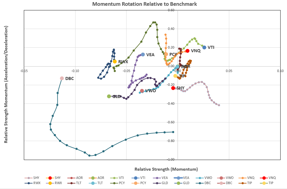
Where we see a general clockwise rotation of momentum over time (the length of the tail).
If we accept that “momentum” is a valid “anomaly” that can be used to “predict” future performance, then it seems that this data should be useful in the development of an investment system. However, I have struggled, for over 12 months, to find a system that outperforms the (BHS, LRPC, HA or DM) models/systems that are presently built into the Kipling workbook.
Nevertheless, it is probably interesting to show some results from these efforts (at least to where I am at the present time).
The workbook that I am using contains a worksheet that looks something like this: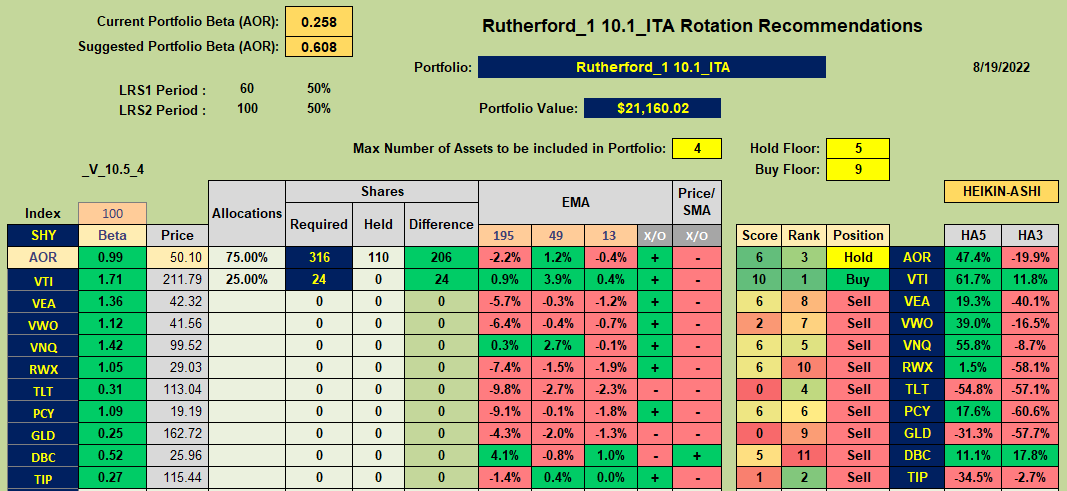
That might look very similar to the current Kipling “Tranche” sheet without some of the momentum/trend columns towards the left side of the sheet. However, “under the hood” it is quite different in that:
- Rather than use raw price data to measure momentum (as the slope of the linear regression line through the raw data over selected look-back periods) a ratio of asset price/reference asset price is calculated first. The slope of this ratio data set is then used for the linear regression calculation. In the above screenshot AOR is used as the reference asset, so e.g. for VTI, the ratio of Price(VTI)/Price(AOR) is calculated. A calculation of the slope of linear regression line through this ratio data set is then calculated.
- In the Kipling workbook, Volatility is incorporated in the rankings by weighting the volatility of each asset such that high volatility (riskier) assets are penalized in the rankings through their relative rankings. In the “rotation” workbook the ratio data is used to calculate the R-squared value associated with the linear regression line. R-squared is considered a measure of “goodness of fit” such that a high value of R-squared represents a “good fit” with minimum deviations from the regression line. This is most likely when volatility is low. Thus, in this model the slope of the linear regression line (momentum) is multiplied by the R-squared value of the fit. This is a more quantitative way to adjust momentum rather than to simply sum weighted rankings (relative numbers).
- As noted above, the product of momentum (linear regression slope) and it’s associated R-squared value is used as the primary measure of long-term momentum and the slope of these data points over a shorter time frame (10-days in the above example) is used to determine whether momentum is increasing (accelerating) or decreasing (decelerating) in the shorter term. This is equivalent to setting the BLSH filter in the Kipling workbook to “Yes”. These 2 values are plotted against each other along the x- and y-axes to generate the rotation graphs seen in the first screenshot above.
- Overall asset Rank is calculated in much the same way as in the Kipling workbook (using the modified longer-term and shorter-term momentum values noted above) together with the short-term HA rankings. Score is likewise calculated in the same way as in the Kipling.
- Note that the EMA data, as calculated in the Kipling, is also retained. This data is used in the new “rotation” model – specifically the 13/39 EMA crossover (X/O) data and (maybe) the Price relative to 13 EMA value (13 EMA column).
The above descriptions define inputs to the new model – along with other parameters used in the Kipling – momentum look-back periods (60- and 100-day in the above example) and weights (50/50), HA look-back periods (5 and 8 in the example), values for Hold_Floor and Buy_Floor (5 and 9) and number of assets to hold in the portfolio (4). Maximum asset allocations can also be set in the Portfolio sheet as for the Kipling.
Back-Test Results
Model 1 – Monthly (5-week) Reviews
We know that timing (review date) luck is one of the biggest factors in determining portfolio performance and that we should not rely on a single back-test to evaluate potential future performance – the Rutherford Review posts demonstrate this very effectively. I have therefore chosen to run back-tests in much the same way as the tranche reviews used in my Rutherford posts. i.e. each tranche is reviewed once every 5 weeks and the total portfolio is composed of 5 tranches.
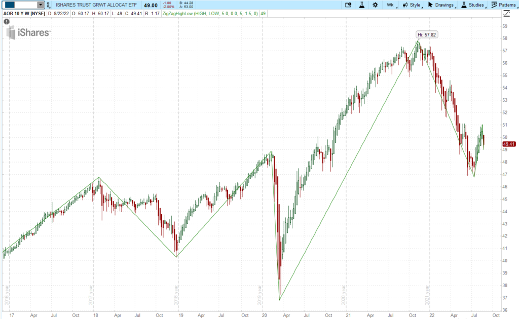
Because of the time-consuming nature of these manual back-tests (downloading new data for each data point and copy/pasting allocation adjustments) I have run tests from the end of 2016 through to the present (~5.5 years). While this is a relatively short period of time it does contain a wide variety of market conditions – from extremely bullish, to bearish and a “catastrophic” crash (2020 Covid crisis).
-
-
-
-
-
- 2017 – Bullish
- 2018 – Bearish
- 2019 – Bullish
- 2020 – Catastrophic Crash plus fast recovery
- 2021 – Bullish
- 2022 – Bearish
-
-
-
-
Model 1 “Rules”:
-
-
-
- Buy requirement
- Score > Buy_Floor
- 13/39 EMA X/O = “+”
- Hold requirement
- Already Holding
- Score > Hold_Floor
- 13/39 EMA X/O = “+”
- Else Sell
- Buy requirement
-
-
All above within Max allocation condition.
Based on the above rules the performance looks like this:
Back-tests are run on the Rutherford portfolio assets since these are consistent through previous back-tests and are well diversified between asset classes whilst limited to a small number of assets (10). For these tests I have set the maximum number of assets to be held to 4 – consistent with previous back-tests on this group of assets.
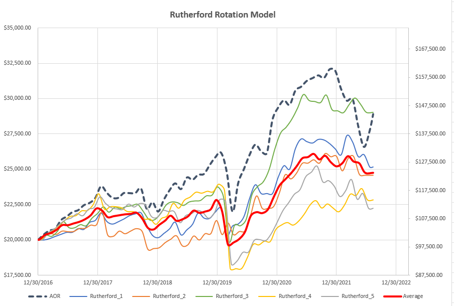
As we can see, the “Average” performance (accounting for timing/review date luck) falls below the performance of the benchmark AOR fund. One tranche (green line) ends up matching the benchmark fund with the other 4 tranches falling short (at least in terms of returns). We have a ~35% difference in returns between the best and worst performing tranches over the 5.5 yr period. The “average” return is ~50% lower than the benchmark return over the ~5.5 yrs.
Model 1 – Weekly Reviews
In order to minimize the impact of review-date (timing) luck I also ran through tests with weekly reviews. The first test used exactly the same system but was adjusted weekly rather than averaging monthly reviews. The results are shown in the following figure:
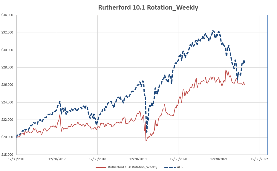
As can be seen, the final returns from weekly reviews ($6,007) are slightly higher than the average returns from monthly adjustments of 5 tranches (~$4,760).
Model 2 – Weekly Reviews
Despite the laboriousness of manual back-testing it does allow us to observe the values of other parameters that might be considered for inclusion into the model/system. One of these parameters that caught my attention was the simple condition of whether current price was above or below the shortest-term EMA (13 EMA in this case). Consequently I decided to add this as a filter to the system i.e :
Model 2 “Rules”:
-
-
-
- Buy requirement
- Score > Buy_Floor
- 13/39 EMA X/O = “+”
- Price > short-term EMA (13 EMA)
- Hold requirement
- Already Holding
- Score > Hold_Floor
- 13/39 EMA X/O = “+”
- Price > short-term EMA (13 EMA)
- Else Sell
- Buy requirement
-
-
Adding this additional filter produced the following results (green line):
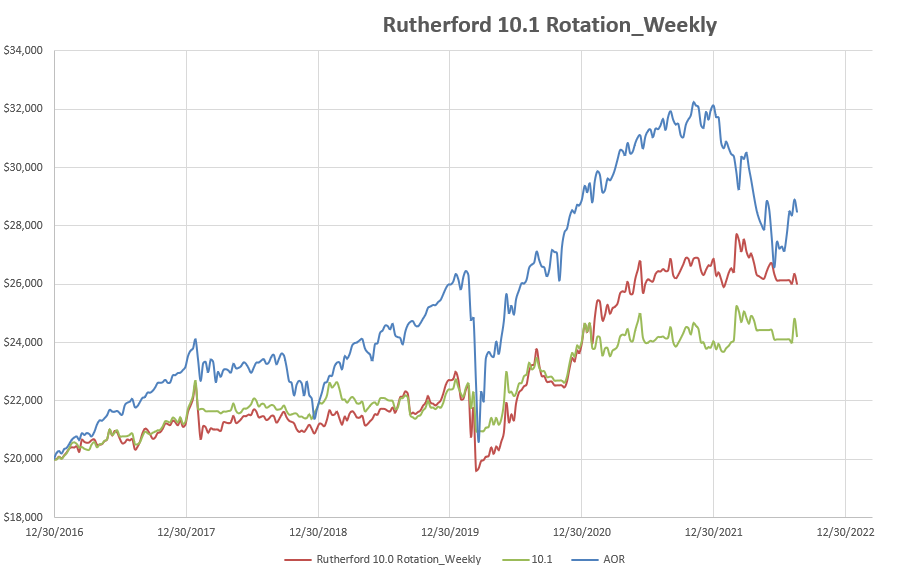
The system looked good for 4 years, and was very reactive to downturns, but was very disappointing in the 2021 bullish markets where it remained stagnant.
How can we evaluate these Systems?
The answer to this question probably depends on whether an investor is focused on returns or risk.
Let’s take a look at some statistics:
- Reference AOR Fund:
- Internal Rate of Return (IRR) over 5.5 yrs – 6.48%
- Volatility – 25.11%
- Sharpe Ratio – 0.26
- Model 1 Weekly
- Internal Rate of Return (IRR) over 5.5 yrs – 4.77%
- Volatility – 21.60%
- Sharpe Ratio – 0.22
- Model 2 Weekly
- Internal Rate of Return (IRR) over 5.5 yrs – 3.46%
- Volatility – 17.17%
- Sharpe Ratio – 0.20
Thus, if we are focused on returns, a buy-and-hold strategy of holding AOR would have produced the best results – but with the maximum risk (as measured by volatility). For example, we would have experienced a 22% Draw-Down through the 2020 Covid crisis.
If more focused on risk, then model 2 offers the lowest risk with volatility at only ~17% (vs 25% for AOR). During the 2020 Covid crisis Draw-Down was restricted to ~7.8%.
Model 1 comes in somewhere in between with 2020 Draw-Downs at ~14.7%.
In terms of risk-adjusted returns, as measured by the Sharpe Ratio, holding the benchmark AOR Fund still comes out on top – despite having to absorb the 2022 22% Draw-Down.
Your reactions to this analysis is welcomed.
David
Discover more from ITA Wealth Management
Subscribe to get the latest posts sent to your email.
This is a clear and impressive analysis. Obviously tons of labor to achieve, thank you.
I’m writing this on Tuesday, 2023 Feb 07. I had not seen this earlier and am glad I searched on the term “Rotation.” It appears this analysis was completed around 2022 mid-August, is that correct? If you have this data stored, I have these questions:
1. How would the rotation models above compare or correlate with an equivalent BPI approach?
2. Based on what you see in this analysis, how would that inform your TSLO models and decision?
All the best,
– Lee
Lee,
Thanks for the kind comments – and yes, this report was posted mid-August last year. Since that time I have chosen to manage the Rutherford Portfolio using model 2 as above on 5-week reviews of 5 tranches separated by a week in terms if timing adjustments to the 5 tranches. The Rutherford posts since 12/19/22 show the performance of the system since moving from the original BHS model/system.
I can only comment on performance relative to a BHS-managed model since I have not attempted to use the BPI approach to manage the Rutherford asset list – and to speculate would be pointless. Lowell has recently (i.e.in the same approx time frame between mid-August 2022 and today) started to use the BPI model to manage some of his portfolios – so maybe a comparison between the Rutherford performance and one of Lowell’s portfolios (containing very similar assets) might be useful. Maybe Lowell can comment on which of his BPI portfolios he feels most closely matches the Rutherford.
As you are probably aware I (personally) don’t like using TSLOs since all the evidence I have suggests that, over the long term, returns are reduced even if draw-downs are also reduced and re-entry is difficult to time. I therefore prefer to reduce system volatility and to live with the draw-downs resulting from system suggestions/recommendations as per model 2. Back-testing the rotation system vs BHS system (as noted above) does not appear to result in higher returns (either in absolute or risk-adjusted (Sharpe) terms) but the lower volatility and draw-downs has its attractions. I am comfortable in using this model as a portion of a system-diversified total portfolio (multiple sub portfolios using different systems) and it should be interesting to follow this in real time (no possible bias as in a beck-test) as we go forward in time with the Rutherford reviews. My expectancy is to see slightly poorer returns but with the benefits of less downside risk (lower draw-downs).
As we comment may times on this site – no single system is likely to outperform all others over all market conditions – so system diversification should be a benefit. It might be interesting to split a portfolio (any portfolio) into 2 portions – 50% managed using a rotation system and the other 50% managed using a BPI system. I suspect that one system will perform better than the other under different market conditions – but which system might perform better over the long term (say 10 years) I have no idea.
David
“Maybe Lowell can comment on which of his BPI portfolios he feels most closely matches the Rutherford.”
Only two portfolios are managed using the BPI model and they are: Einstein and Kepler. Check those out. While the Einstein is outperforming its benchmark, the Kepler falls short.
Lowell