Reproduction of original Bugatti Aerolithe.
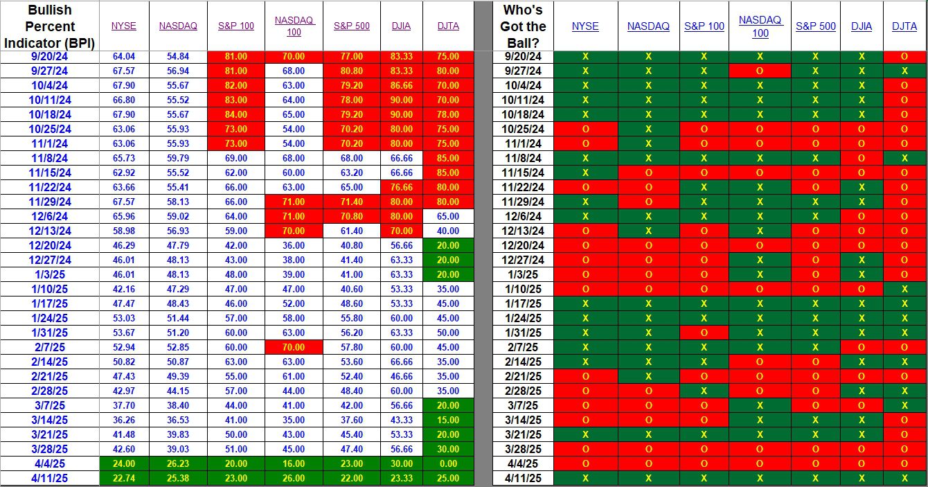
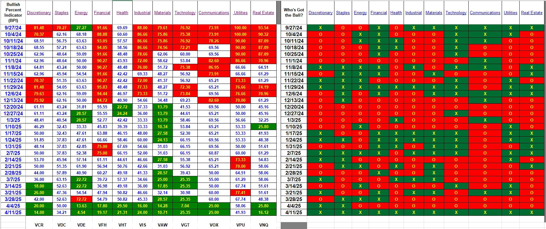
Based on the high volatility of the U.S. Equities market this week I thought it expedient to post the latest Bullish Percent Indicator (BPI) data. For those not familiar with BPI graphs, it is an entirely different way to plot price movements of stocks, ETFs, or in this case market indexes and market sectors. The two tables in this post are the results from seven major indexes and eleven market sectors.
What does a Bullish Percent Indicator graph look like? Here is an example for the Materials sector. Data from the sector table is used to clue investors as to when to purchase a sector and when to sell a sector. The seed for this idea was planted in late 2022.
Index BPI
The current bear market drove every index into oversold territory these past two weeks. The low point came in mid-week when every index and every sector, with exception of Utilities, dropped into the oversold zone.

Sector BPI
Friday’s uptick moved Staples out of the oversold zone. Mid-week Staples was oversold so shares of VDC were purchased. The three portfolios employing the Sector BPI investing model are: Carson, Franklin, and McClintock. All were reviewed this past week.
The right-hand section of the following graph gives an overview as to whether the sector is trending up or down. Friday’s up move was sufficiently strong to move all sectors into X territory. The left side is more precise and this is where we check the percentage of bullish stocks within a particular sector. In the case of several sectors the percentage of bullish stocks is lower this week compared to last week.
At this point we now wait for the sectors to move up into the overbought zone or 70% bullish and higher. This could take months before we see any sell signals.

Comments are always welcome.
Discover more from ITA Wealth Management
Subscribe to get the latest posts sent to your email.
The option to leave a comment was in conflict with a particular plugin. Hope this conflict is resolved as the JetPack plugin is useful.
Lowell