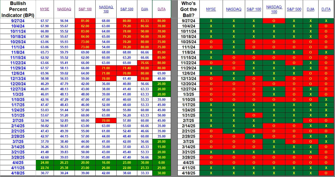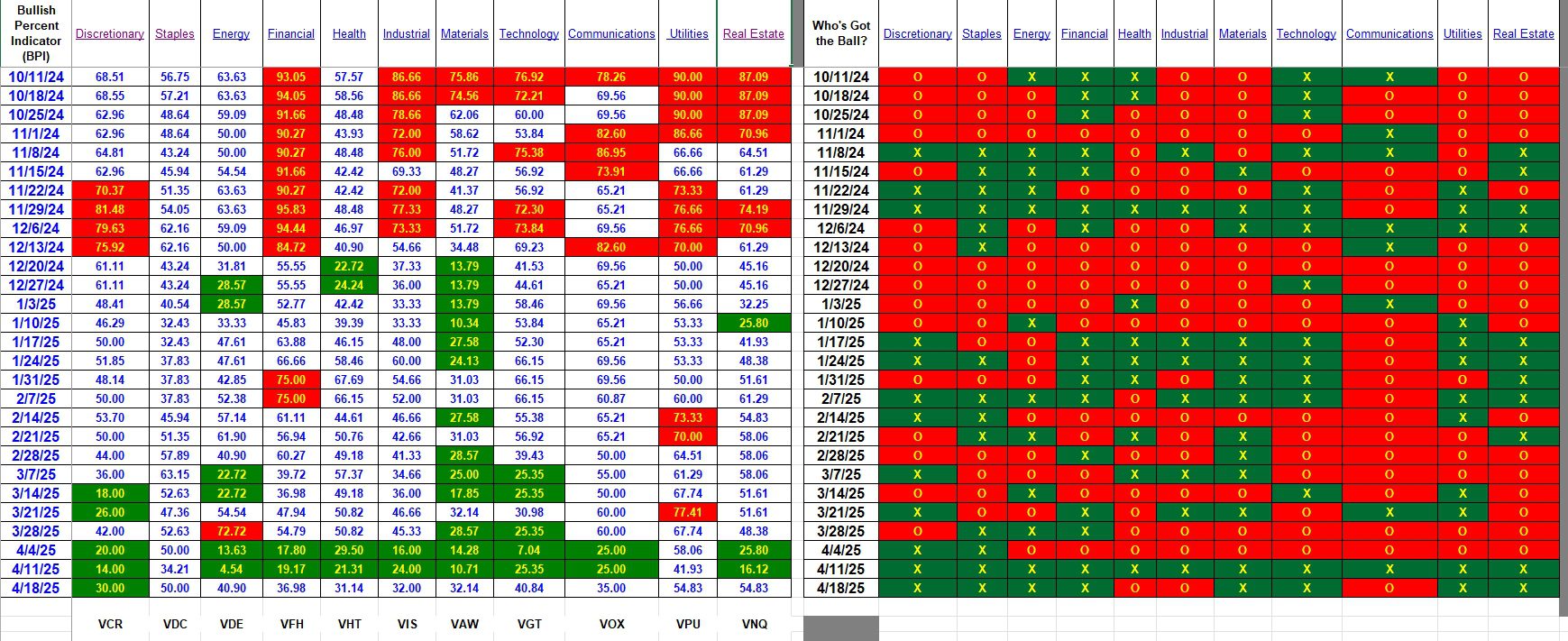
Most weeks there is so little market action among the major sectors and indexes that updating the Bullish Percent Indicator (BPI) data is unnecessary. Tariff uncertainty is roiling the markets to where updating is meaningful. The two tables below examine what is happening to seven major U.S. Equity markets and eleven sectors that make up the S&P 500. There is a lot of overlap in stocks held in the different indexes so pay most attention to the NYSE, NASDAQ, and S&P 500 in that order.
Index BPI
How does one read the information in the following table? First look at the right-hand side of the table. Last week all indexes turned bullish. This week all are still bullish with exception of the transportation average (DJTA). The right side provides a broad or quick view of what is happening to U.S. Equities. Are stock moving up or down? If green they are moving up. If red they are moving down.
Now move to the left side of the table for more precise information. Here we show the percentage of bullish stocks within each index. I favor the NYSE and NASDAQ as they hold the greatest number of stocks giving a broader view of what is going on in the U.S. stock market. Keep in mind we are not providing any information related to international equities.
Take the NYSE. This week, which ended on Thursday, the index closed with 30.77% of the stocks bullish, up from 22.74%. Green background indicates the index is oversold while red indicates the index is overbought.
Before moving down to the Sectors, take a close look at DJTA. While the right side tells us the index is bearish (red) the percentage moved up from 25% bullish to 30% bullish. This “anomaly” occurs when there is a shift during one of the last trading days of the week. In other words the index went up most of the week, but then fell at the end of the week moving the index from bullish to bearish even though the percentage gain for the entire week was up. This is another reason why I pay more attention to percentages vs. the bearish-bullish moves shown on the right side of the table.

Sector BPI
The following table breaks the U.S. Stock Market into 11 Sectors. This is where we go for information as to how to manage the three Sector BPI portfolios. They are: Carson, Franklin and McClintock. To learn more about the Sector BPI management model, follow one or more of these portfolios.
As this week closed, only Discretionary is oversold. Several sectors are barely out of the oversold (green) zone. As I recall, Staples dipped into the oversold zone mid-week so we were investing in all sectors with exception of Utilities. Due to lack of cash I may have missed populating all sectors up to the recommended percentage.
The underlying hypothesis behind the Sector BPI investing model is to buy low and sell high. Do to an oversold market recently we moved into most of the sectors. Now we patiently wait for individual sectors to rise to the overbought zone (70% bullish or higher) at which time we place a 3% Trailing Stop Loss Order (TSLO) under the ETF representing that particular sector.
There are few other tweaks to managing the Sector BPI portfolios. Readers will pick up these fine points by following the management of the three critical portfolios.

What does a Point an Figure (Pnf) graph look like? Here is a link to the Energy sector. A few things to note.
- Along the X-axis we do not see dates. Rather, the graph moves to the right when there is a percentage change moving from bearish to bullish or bullish to bearish. I use a 3% reversal percentage.
- Energy is rebounding off a bottom of 0%. A few days ago there was not a single stock within the Energy sector that was bullish. 100% were bearish. This is most unusual to see a sector take such a hit.
Comments and Questions are always welcome.
Explaining the Hypothesis of the Sector BPI Model
Discover more from ITA Wealth Management
Subscribe to get the latest posts sent to your email.
Leave a Comment or Question