
Winter in Ontario
Last week, Lowell posted a blog asking the question “How Risky is Your Portfolio?” and reminded us that portfolio returns are a function of the expected returns from the assets in our “quiver” and the risk associated with these assets as represented by their volatility.
I thought I would try to provide another perspective on this topic by trying to illustrate (without quantifying) the complexity of this dilemma by providing some visualizations.
Let’s start by taking a look at the performance of the US equity markets since 2003 through the eyes of the SPY ETF:
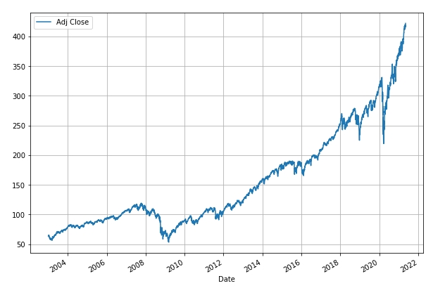
From the above figure we can see that SPY has increased in value from a dividend-adjusted price of ~ $64 on 02 January 2003 to ~$422 today. This calculates to a compounded annual growth rate (CAGR) of 10.4%. But, as we can see, this comes at the expense of high volatility at times – the annualized volatility of SPY over this period calculates to 19%. Note that this is close to Lowell’s 18.5% value for the most recent 5-year period.
Of course, history is interesting but, as investors, we would like to be able to predict where we might go in the next couple of years.
From an academic point of view we can try to simulate “expected” performance by taking the historical data (10.4% CAGR : 19% Volatility) and using this to generate a Gaussian distribution (Bell Curve) of daily returns with a mean of 10.4%/252 (adjusted for daily sampling) and with a Standard Deviation of 19%/sqrt(252):
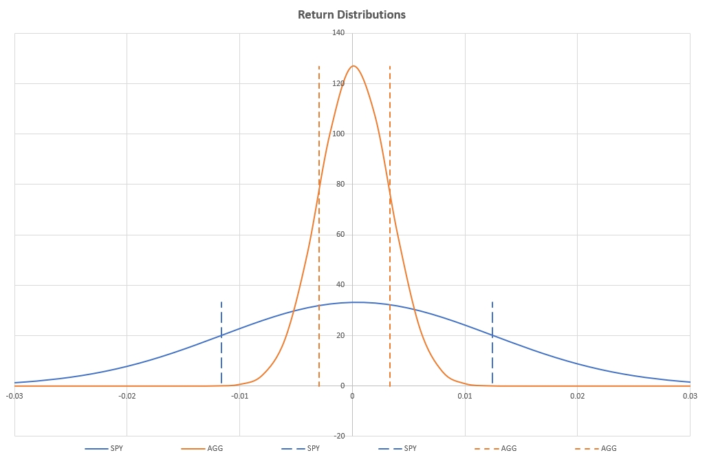
This is shown (blue curve) in the above figure. Although it is difficult to see in the above figure, the positive expected returns are reflected by the fact that the mean (peak of the curve) is located slightly to the right of the zero line. The +/– 1 Standard Deviation returns are marked by the blue dashed vertical lines.
From this we can generate simulated stock behaviour by selecting random returns from the above distribution curves and assuming Geometrical Brownian Motion (GBM).
Let’s see what this looks like. But first, let’s look at the actual behavior of SPY over the past 2 years:
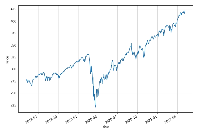
This period includes the Covid-19 pullback in 2020 but price has increased from ~$275 to ~$425 (average 27% annual return) over this 2-year period – returns that far out-perform the longer term average (10.4%).
So let’s see what simulated charts might have looked like. These simulations start with price at ~$275 (actual price) 2 years ago and simulate possible price paths over a 2-year period based on the assumptions of Geometric Brownian Motion (GBM):
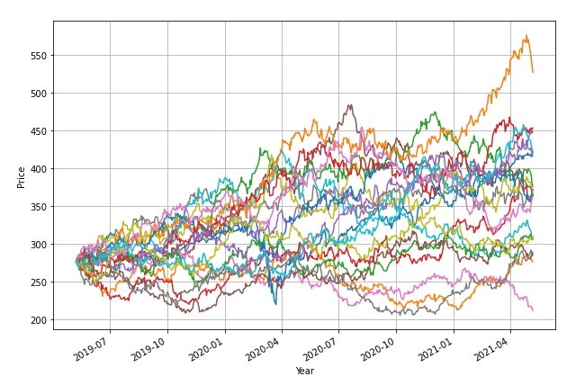
The above plot shows 50 possible paths based on the historical return distributions for SPY. As we can see, there is significant variance – including paths with losing returns. Due to the fact that actual performance of SPY over the past 2 years has exceeded historical performance, only 5 (10%) of the above paths result in better performance.
Although these simulations can be criticized because they assume a normal Gaussian distribution of returns (do not include a skew that exists in “the real world” and include “fat tails”) and the simple model does not include impulse effects (flash crashes) and assumes that volatility is constant (that it certainly is not) – even without adjustments for these effects it should be obvious that variance is extremely large.
At the end of the day, actual performance does fall within this envelope – but the envelope is large.
Let’s now take a look at Bonds – as represented by AGG:
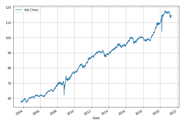
Actual prices from 2003 to present show a 4.2% CAGR with a volatility of 4.98%. This volatility is higher than Lowell’s number for the past 5 years (3.15%) but does represent average performance over ~18+ years.
This distribution is reflected by the yellow/orange curve in figure 2. Obviously the 1 SD limits (dashed vertical lines) are much narrower than for SPY, reflective of the lower volatility.
Looking at the actual performance of AGG over the past 2 years:
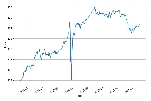
We see a smoother curve (with the exception of the March 2020 Covid-19 meltdown – note that correlations broke down and Bonds did not provide a hedge for equities) with an average annual return of ~5% (cf 4.2% CAGR).
If we generate simulated GBM paths over this 2 year period we get the following picture:
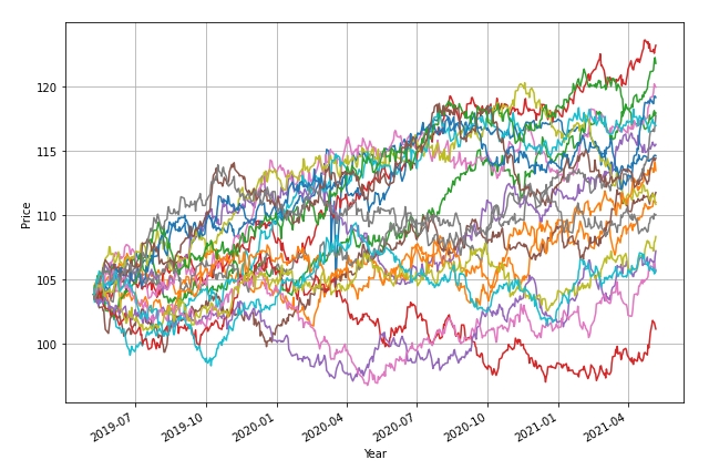
again enveloping the actual path that falls close to the center of the envelope.
The two GBM graphs provide a visual re-enforcement of what we already know – that although assets with lower volatility, such as bonds, come with less risk ((narrower envelope) than assets with higher volatility, this comes at the expense of lower returns.
So, what does all this mean? – not too much except to demonstrate the degree of uncertainty that we face when we invest.
Diversity between assets can help reduce portfolio risk – but even this fails when historical correlations (e.g. inverse equity/bond correlations) break down – and these usually do so in periods of severe meltdown/distress (Covid-19 shock).
The only message that comes out of this is that investment is hard and having long term staying power to weather the storms is essential in order to get through it. Diversification and position sizing can help reduce volatility (risk) so these aspects of investment should not be ignored. These simulated plots also show why timing/review date luck can play a significant role in determining portfolio performance – especially in the short term.
I hope this post provides readers with an interesting “visual” perspective of market behavior.
David
Discover more from ITA Wealth Management
Subscribe to get the latest posts sent to your email.
You must be logged in to post a comment.