Forest Path- Orton Effect
We lead off March with a review of the Schrodinger portfolio, a computer managed account housed with Schwab. The Schrodinger is known by Schwab as an “Intelligent Portfolio.” It falls under the general category as a Robo Advisor portfolio.
The Schrodinger was first launched back on July 31, 2017 so we are beginning to have a useful history. I use 12/31/2021 as the launch date as several other portfolios were launched in late 2021 or very early in 2022. This permits a comparison between the various portfolio regardless of their investing models. Performance data is published approximately every six weeks.
Of all the portfolios tracked here on the ITA blog, the Schrodinger is the easiest to manage as there is absolutely nothing to do other than to save and add money to the portfolio. Schwab’s computers do the rest, including tax managing the account.
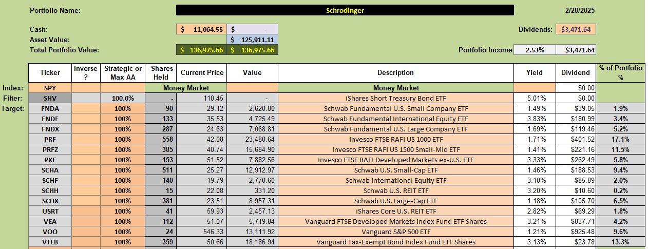
Schrodinger Asset Allocation Holdings
Below are the current asset allocations for the Schrodinger. No new transactions have occurred for any weeks and when they have happened shares were added to the portfolio. It is extremely rare for shares to be sold out of the Schrodinger.

Schrodinger Performance Data
Since 12/31/2021 the Schrodinger has outperformed all six potential benchmarks. This despite holding 8.1% of the portfolio in a money market.
The requested ratio of stocks/(bonds & cash) is 80%/20%. I also requested the portfolio concentrate on U.S. Equities and to down play international equities.

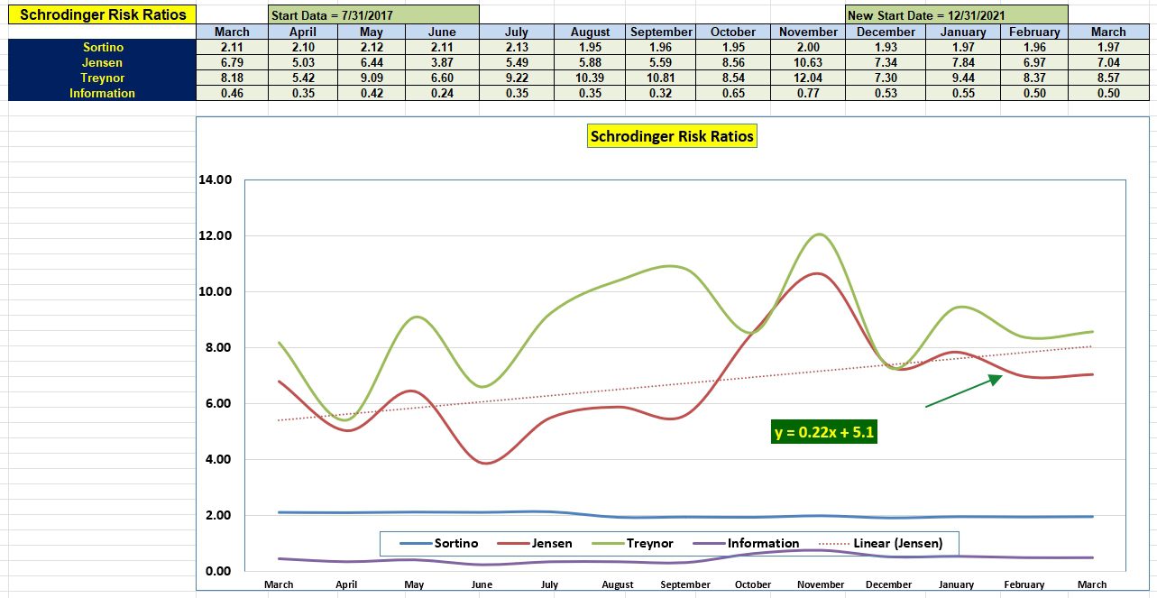
Schrodinger Risk Ratios
Pay little attention to the March data as it only shows what happened the last few hours. The slope (0.22) of the Jensen Performance Index is one of the most important pieces of information found within the following data table.

Comments are always welcome.
Discover more from ITA Wealth Management
Subscribe to get the latest posts sent to your email.
The one-year Linear (Jensen) graph for Schrodinger is impressive. In your periodic analysis of portfolios, could the one-year Linear (Jensen) for each be presented in a consolidated graph? I ask, as the consolidate graphic could be a very interesting way to visually display performance.
BTW, I ran a site search on the term “Linear (Jensen),” which came up empty.
All the best,
– Lee
If you are asking for a graph for each risk ratio, the graph would become much too crowded. Several of the risk measurements do not vary that much over a year of data. All the straight line (curve fit) does is to present a least squares fit of the Jensen data points.
Lowell
Lowell,
Thanks for your reply. I see your point. I had thought of thumbnails of the the rolling one-year linear regression line for the Jensen of each portfolio. So, yes, that would be crowded. Some of my ideas work, many don’t. 🙂
All the best,
– Lee
When I first started reporting on Risk Ratios I plotted the least squares fit for the Treynor. That line detracted from the critical Jensen so quite plotting it. The Sortino and Information graphs tend to be close to zero so the least squares fit would just lie on the curve itself.
Lowell
It will be interesting to see how Schwab computers handle this market down-turn. I expect they will purchase shares in several asset classes. Will let readers know when the Schrodinger next comes up for review.
Lowell
It appears as if adding new Comments is not an option since the latest update of WordPress. Until this is repaired, leave Comments over in the Forum section of the ITA blog.
Lowell