Viewing The Grand Tetons from inside The Chapel of Transfiguration.
While the Millikan portfolio is the one I’ll review this morning, this blog post goes into more detail with respect to Bullish Percent Indication graphs and Point and Figure (PnF) graphs for individual sector ETFs. There may be some confusion and I want to clear this up in this post.
Difference Between BPI Graph and Sector Graph
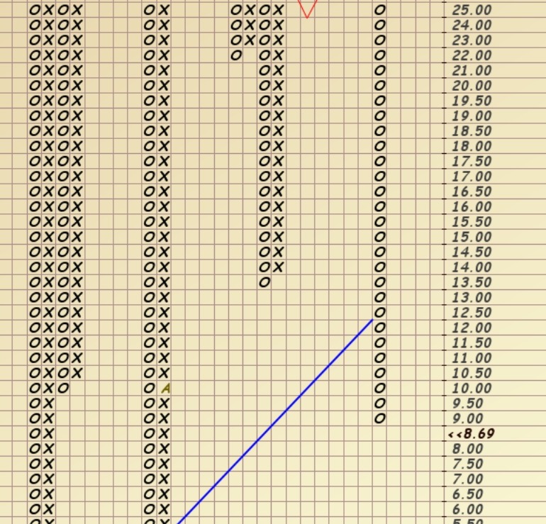
Before moving into the Millikan portfolio analysis I want to explain the difference between information I post nearly weekly with the Bullish Percent Indicator (BPI) data. Below is one such graph. These graphs with X’s and O’s are called Point and Figure (PnF) graphs. These graphs do not move to the right based on calendar dates. Rather, the moves are when there is a change in price or in the graph below, when the percentage of stocks within a sector turn bullish or bearish. I’ll try to simplify the difference between this first graph and the VDE graph or second graph. The copy and paste program I’m using does not permit scrolling so this first graph is only a small section of the actual graph or chart.
- BPI sector graphs scale from 0 to 100 and measure the percentage of stocks within a sector that show bullish signals. A bullish signal is when there are X’s in the right-hand column. The graph below shows O’s in the right-hand column so this sector (Energy) is bearish. Only 8.69% of the stocks in the Energy sector are bullish. This is considered an over-sold condition and that is why the Sector BPI model recommends investing in the Energy ETF, VDE.
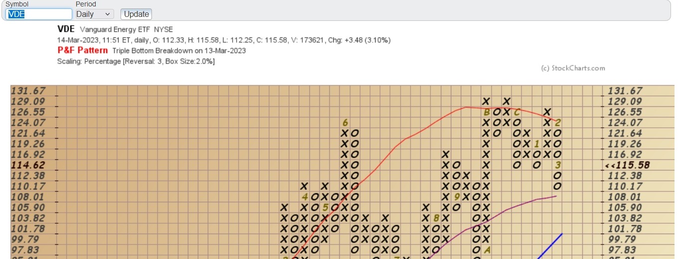
- The second graph is also a PnF description, but it is measuring the price movement of VDE, Vanguard’s Energy ETF. VDE is also bearish and when I pulled the chart from StockCharts, the price of VDE was $115.58. That is likely the closing price for VDE yesterday.
BPI graphs scale from 0 to 100 and measure the percentage of bullish stocks within an index or sector while individual security graphs scale based on the price of the security.
If the difference between the BPI data and individual sector ETF is unclear, ask your question(s) in the Comment section.
In the following table Vanguard’s Energy ETF is bearish. Yesterday, in the Comment section, there was some discussion of following Dorsey’s recommendation to wait until the PnF graph turns positive. Thomas J. Dorsey, author of Point & Figure Charting, is one of the few authorities on PnF portfolio management. If I were to hazard a guess Dorsey’s was likely referring to the individual stock or ETF. In this example, wait for VDE to turn bullish, not wait until the BPI graph turns bullish.
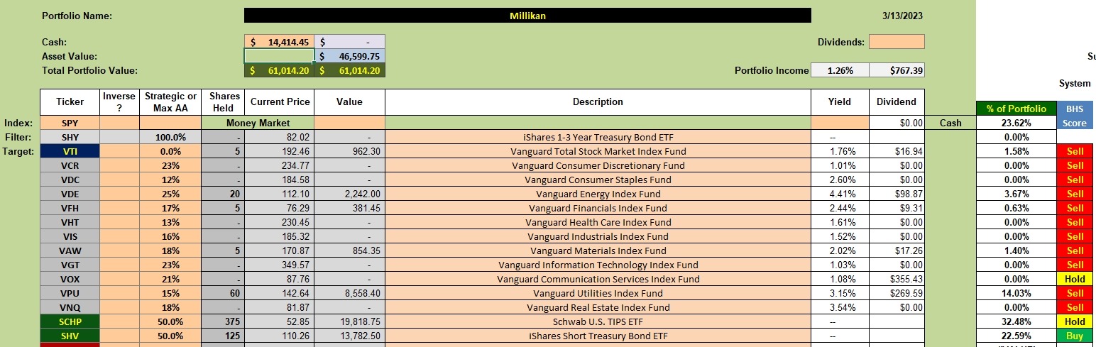
Millikan Sector Investment Quiver and Holdings
Now we move to the Millikan portfolio where we hold several sector ETFs, but most are not fully populated. VPU is close to 15% with a current holding of 14.03%.
To fill the sector (5 in all) currently in the over-sold zone I will need to part with shares in SCHP and most of SHV. The Millikan Percentage Recommendations graph is used as a guide so we slide down to another table.
Millikan Percentage Recommendations
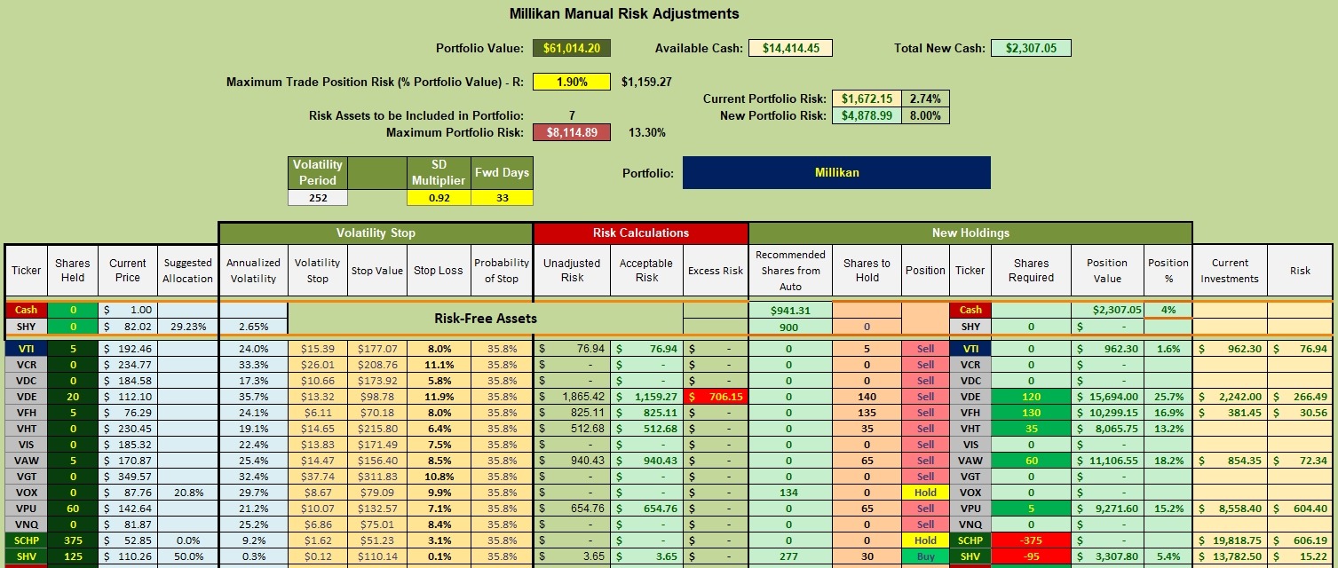
The worksheet shown below is where we make decisions. The first thing I did was to adjust the SD Multiplier to 0.92 so the Stop Loss for VTI moves to 8.0%. The SD Multiplier is one way to control portfolio risk and I prefer VTI not take a larger loss than 8.0%. Moving on, here is the plan when I have this blog post finished.
- Sell 375 shares of SCHP and 95 shares of SHV to raise cash for new purchases.
- Purchase 120 shares of VDE bringing it up to 25.7% of the portfolio.
- Purchase 130 shares of VFH bringing it up to 16.9% of the portfolio.
- Purchase 35 shares of VHT bringing it up to 13.2% of the portfolio.
- Purchase 60 shares of VAW bringing it up to 18.2% of the portfolio.
- Purchase 5 shares of VPU bringing it up to 15.2% of the portfolio.
Millikan Performance Data
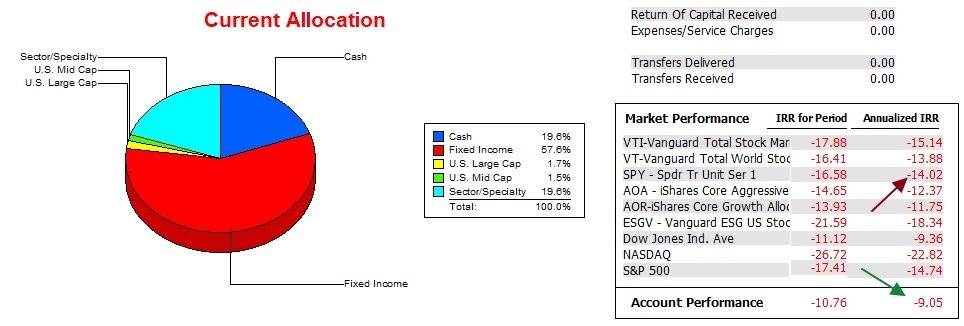
Since late December of 2021 the Millikan lost 9.05 annually. During this same period the SPY lost 14.0% so the portfolio is outperforming the S&P 500, no mean feat.
In the latest version of Investment Account Manager the authors added, by default, three more index benchmarks. I’ll leave the bottom three stay put for now.
Millikan Risk Ratios
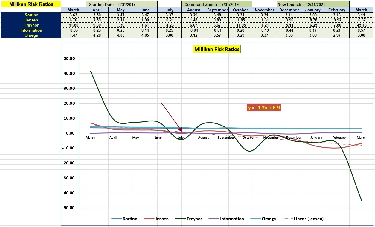
Here we have the risk information associated with the Millikan. All recorded data shows a rather stable Sortino Ratio. There is recent improvement or growth in the Jensen Performance Index, but it is well below where it was a year ago.
The Information Ratio reached a new high over this period and that is significant. The Information Ratio measures how well the portfolio is performing with respect to a benchmark and for this review I am using SPY as the benchmark.
The ITA Wealth Management blog site is now free to anyone who registers as a guest. Pass on the site link to family and friends so I can grow this investment site.
Discover more from ITA Wealth Management
Subscribe to get the latest posts sent to your email.
Lowell,
As a follow-up to the Bullish Percent blog (10 March) discussion about Dorsey’s recommendations.
1) Dorsey uses 2% boxes for the Bullish Percent P&F charts. Therefore, a reversal requires a 6% change in the requisite BP chart. He uses ‘traditional’ box sizes for equities. Depending on the magnitude of an ETF, this may or may not be a good way. There has to be a balance with regard to equities or indices, so that you can see the main chart patterns form but not be so fine-scaled that the charts get out of hand.
2) Dorsey uses the BP charts as a signal to be on offense (X’s) or defense (O’s). Reversals to offense/defense are not the actual buy/sell signals but are the first step. Consider them to be the first signal to be ready. You could, if you wish, trim an overbought position, but Dorsey sometimes says to do this, and other times he is mum.
3) The actual buy/sell occurs when the equity of interest (in our case here, ETFs) reverses.
I have not done the Sector ETF research to see if it makes sense to buy/sell solely on the BP charts, or when the ETF reverses, or if both are required. If someone else has done that research, I would like to know the results. If you are already in a position, you might want to use the BP reversal to take 50% of your position off the table, and then when the ETF reversal occurs (or an exit chart pattern forms) take the remaining 50% off the table.
I have used this form of pyramiding on both buys and sells in the past. My experience is that such moves help at market reversals by keeping me sane (behavioral finance at work), but I have not seen much difference in performance one way or another.
One thing I have seen which helps: Dorsey Wright would always put a worksheet together which would perform a top-down (macro-micro) analysis of their portfolio positions/watchlists. Dorsey Wright uses this analysis to determine the primary factors in an equity/ETF move, as 70-80% of a move is dependent upon the macro-environment of both the general market and the business sector. I can send the organization of this worksheet to you if you think this is relevant.
I hope this clarifies Dorsey Wright’s approach and what I have used in the past.
Craig