
Renner’s outdoor extension.
Pay particular attention to the second screenshot as that is where one finds the data to manage the Sector BPI portfolios.
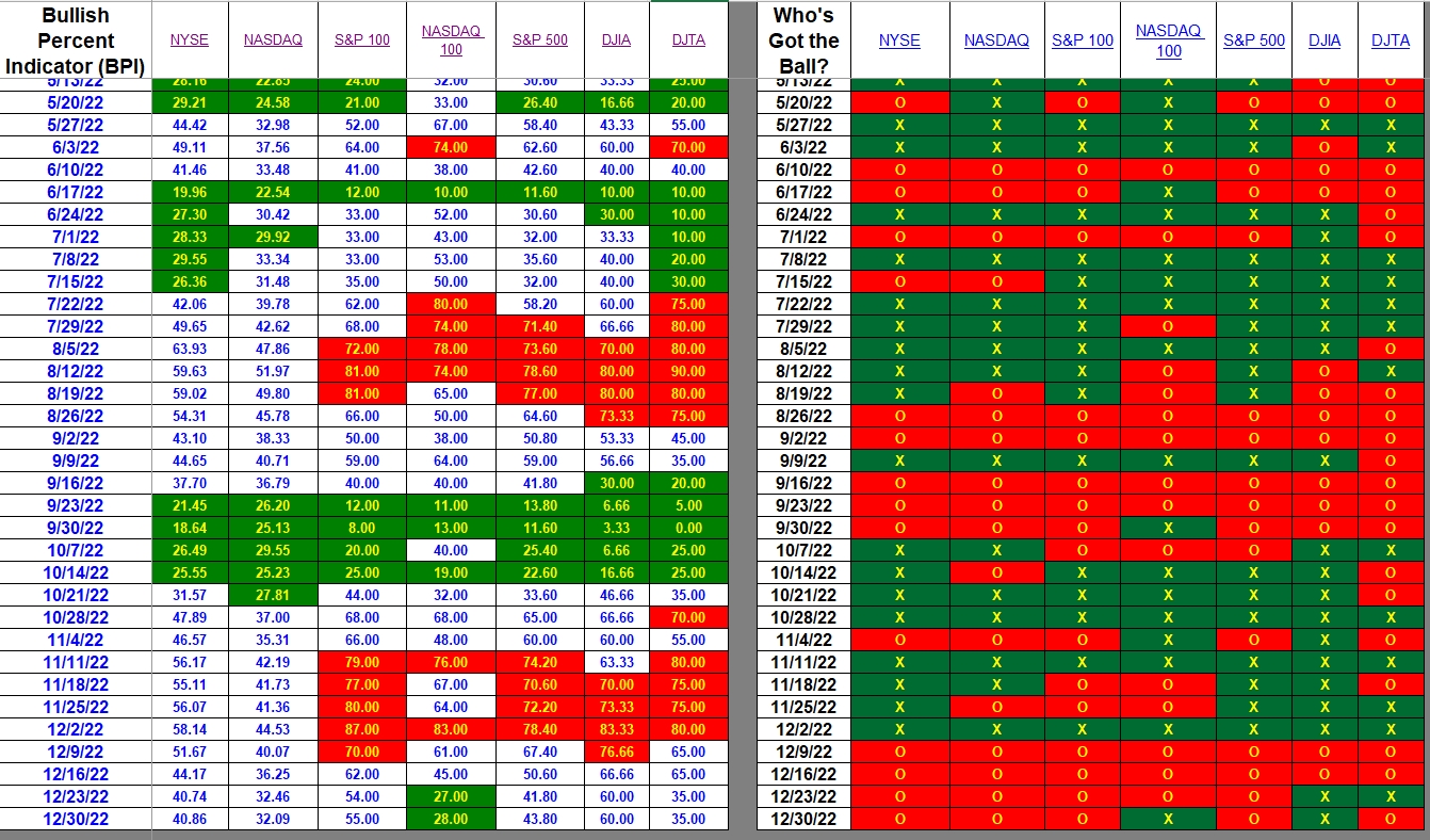
Index BPI
The majority of the indexes are hovering around the 50% mark. The NASDAQ 100 is the outlier as it is over-sold. This over-sold condition also shows up in the Technology sector (VGT).
Sector BPI
Below is the meat and potatoes data table. Here is how to use this information.
- Check your Sector BPI portfolio(s) to see if either VDC or VGT are holding shares.
- If VDC is in the portfolio, set a 3% TSLO for that ETF. If you have already set a TSLO, then do nothing more.
- If VGT is not already in the portfolio, purchase sufficient shares so as to meet your maximum asset allocation. I have Technology (VGT) set at 25% of the total portfolio. You may prefer to use a lower percentage.
- If there are other sector ETFs in the portfolio, do nothing. Let them ride.

Post questions and comments in the Comment section provided.
(Visited 53 times, 5 visits today)
Discover more from ITA Wealth Management
Subscribe to get the latest posts sent to your email.
Lowell Happy New Year! I have followed Point and Figure charting starting years ago with Tom Dorsey’s work but could never make it work for my investing needs. Hence, I am really excited about this new approach you are taking. Keep up the good work. John
John,
Thank you. I think Tom Dorsey applies PnF graphical information to individual stocks. The Sector BPI model is different and I too am eager to see how it performs during this coming year. I’ll not be surprised if 2023 is not another volatile year for equities.
Hi Lowell
Your chart shows 31.7% for telecon.
on Stock charts candle glance for their pre-defined sectors BP % I see 20.0% for $BPCOMM. which is called Communications services sector.
However, there is also a Telecom services sector: $BPTELE that shows 20.0%
VOX as well as XLC both have a high percent ( 40 to 50) in Google, Facebook Disney and Verison
Can you clarify the difference between them?
Bob
Bob,
Here are some guesses. When setting up a PnF graph there are two critical variables called Decimal and Scale Factor. Experiment changing those two parameters and you will see the graphs vary significantly.
As for $BPComm and $BPTELE, they may hold different securities or the Decimal and Scale Factor may be set differently.
As I mentioned before, I followed Jeremy du Plessis guidance for index funds and sectors when I developed the Sector section of the BPI spreadsheet.
There may be other factor at work of which I’m not aware.
Lowell