
Bath, England
It was a brutal week in just about all major markets with the SPX losing a little over 9% from last week’s close – most of this within the last 2 days of the week with concerns over the effects that tariffs might have on the cost of living and the economy generally:
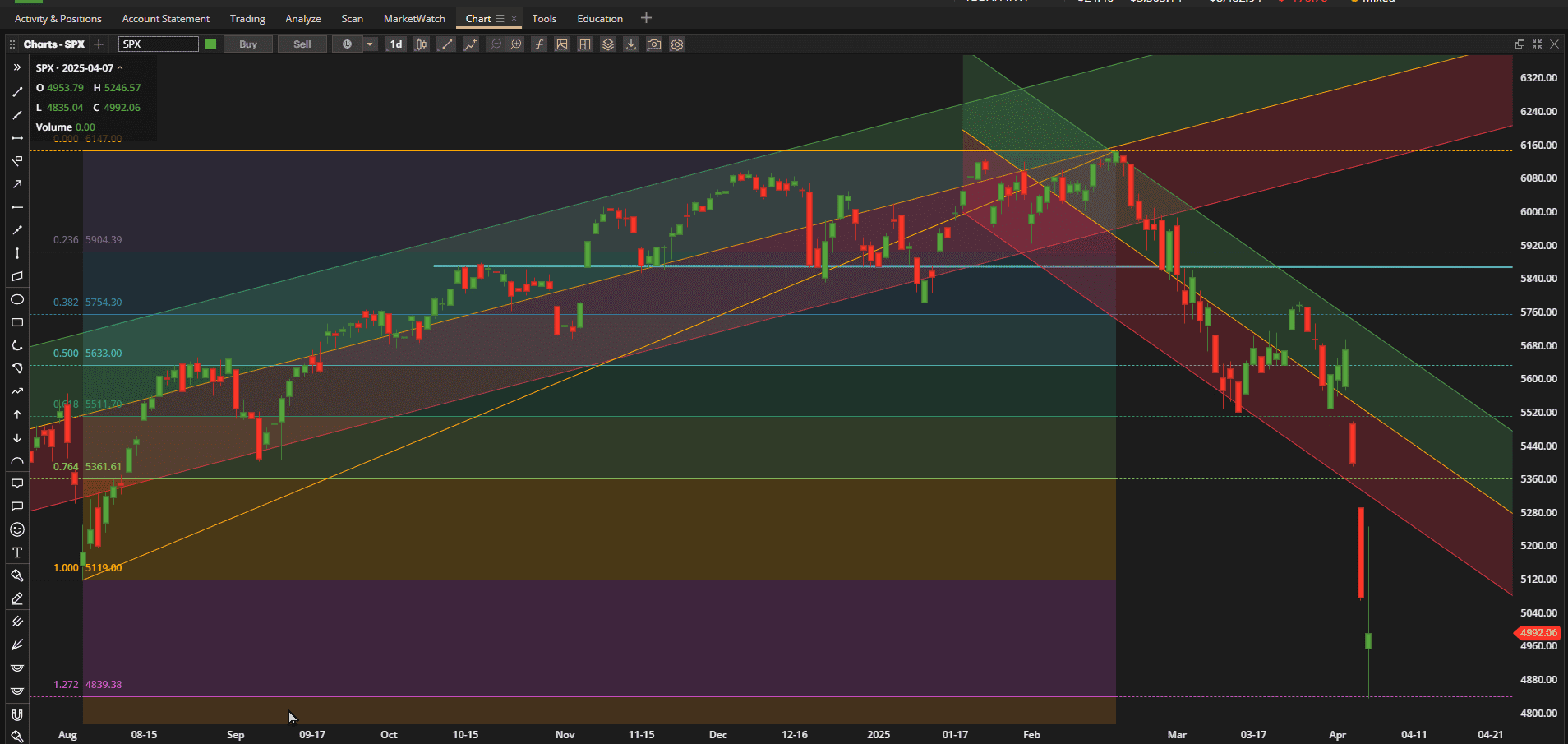 The above chart is the same picture that I have been showing for the past few months and shows the daily prices of SPX (S&P 500 Index) since the lows of last August (2024). I have taken off the annotations that I was showing to identify “patterns” in the chart so as to focus on the Fibonnaci retracement levels from the February highs. As we can see from the above screenshot we closed the week (second candle from the right) just below the potential support line of 5120 or at the August lows i.e. we are now back where we were Last August. I have also included today’s candle as of the time of writing this post (~ Mid-day Monday) and we can see that prices have continued to drop before touching the 127.2% Fibonnacci retracement level at ~4835 from where they have since bounced (at least temporarily).
At this point we don’t know whether this “correction” – now at ~17% from the February highs – is over, or whether we will see more weakness to the downside. Certainly we are well outside of the recent downtrend channel – and this may mean that there has been an over-reaction and that the selling is a little overdone (in the “oversold” zone of many technical indicators). However, these indicators can stay oversold (longer than we can stay solvent?) for a long time. So let’s take a wider look back to 2020 and the lows following the Covid crisis:
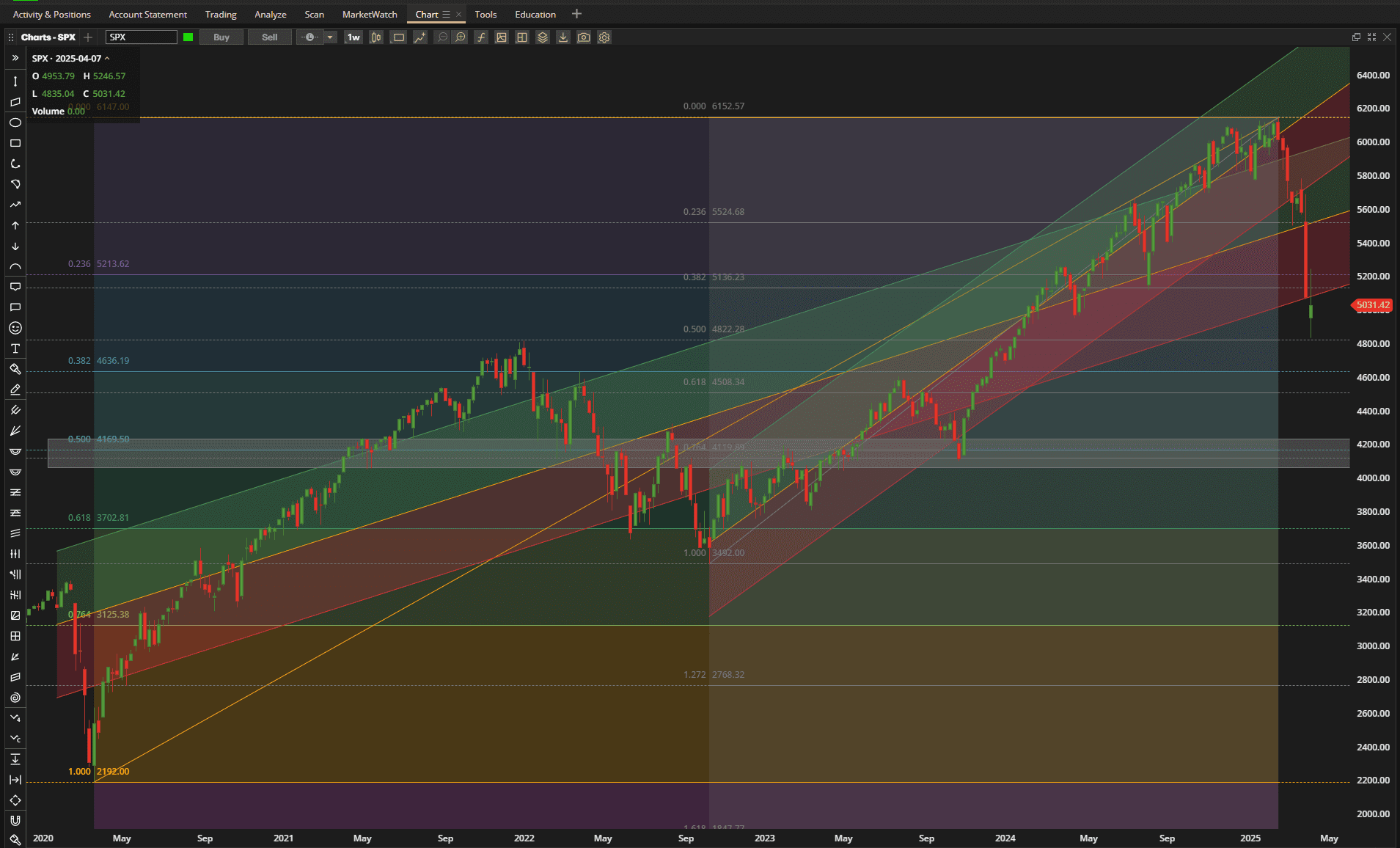 Now, drawing trend lines, channels or pivot points and selecting/identifying Fibonacci extremes can be a little subjective and dependant on the time frame that we want to focus on – but, sometimes it helps to try to combine these time frames. So, in the above screenshot I have chosen 2 time frames in the weekly price chart – from the end of the Covid crisis in 2020 to the recent all-time high in February (the long trend channel from the left hand edge to the right hand edge) and from the 2022 low in October 2022 following the 2022 “correction” (>10% pullback) to the same February high. And I have identified the major Fibonnacci retracement levels on the 2 time frames.
The first thing that we note (on this weekly chart) is that the current “correction” correspons to a pullback to the 50% retracement level on the shorter term time-frame (Oct 2022- Feb 2025) and, while this is a different Fibonnaci number from that shown in the first screenshot (daily chart from August 2024) it is, neverless, interesting that both are important ratios in the Fibonacci sequence despite being analyzed on different time frames. It is also interesting to see that this ~4800 level also provided resistance at the January high in 2022 (on the longer term time frame). We are obviously currently sitting well outside the lower boundary of the 2 uptrend channels.
Based on the 2020 – 2025 time frame, if we are to see further weakness, we might expect to hit potential support at ~4600 (38.2% retracement) and even stronger support at ~4130 or the 50% retracement level. 4130 also corresponds to a 76.4% retracement on the Oct 2022 – Feb 2025 time frame and, while this ratio is not considered to be quite as significant as some of the others, the fact that it provides reinforcement is interesting. A pullback to the 4160 level would represent a 32% retracement in price from the February highs.
Although not as obvious, there is also possibe confirmation/overlap at ~4600 where the longer term 38.2% retracement and 61.8% shorter term retracement come close – but this may represent a “zone” of resistance – rather than a more closely defined level – where we might see some sideways consolidation.
A 100% pullback towards the Oct 2022 lows at ~3600 would see a 40% retracement in price from the highs – not something we would like to see in 2025.
Compared to other major asset classes this is how US equities fared over the past week:
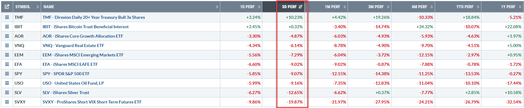 compared to other equity markets they were about on par but there was an ovious rotation to Bonds. Oil lost out but, to me (probably because I’m holding positions in it in the Rutherford-Darwin Portfolio), the biggest surprise was the weakness in Silver (SLV). Gold held up well and Silver usually moves with Gold – but this time it was different and just about as I was expecting to take profits on Wednesday (within $0.10 of hitting my profit target), the crash on Thursday and Friday triggered an exit stop loss for me. I don’t really understand the significant difference in performance other than the fact that Silver has more industrial uses and the threat of tariffs may be the cause of the weakness.
In the Rutherford-Darwin Portfolio, BIL (T-notes) were not affected and continue to chug along onward and upward. The diversified Darwin portfolio, that is essentially a “Buy-and-Hold” portfolio, unless weightings/allocations get significantly out-of-line, lost ~8% on the week – slightly less than losses in the equity markets themselves. Performance of this portion of the portfolio looks like this:
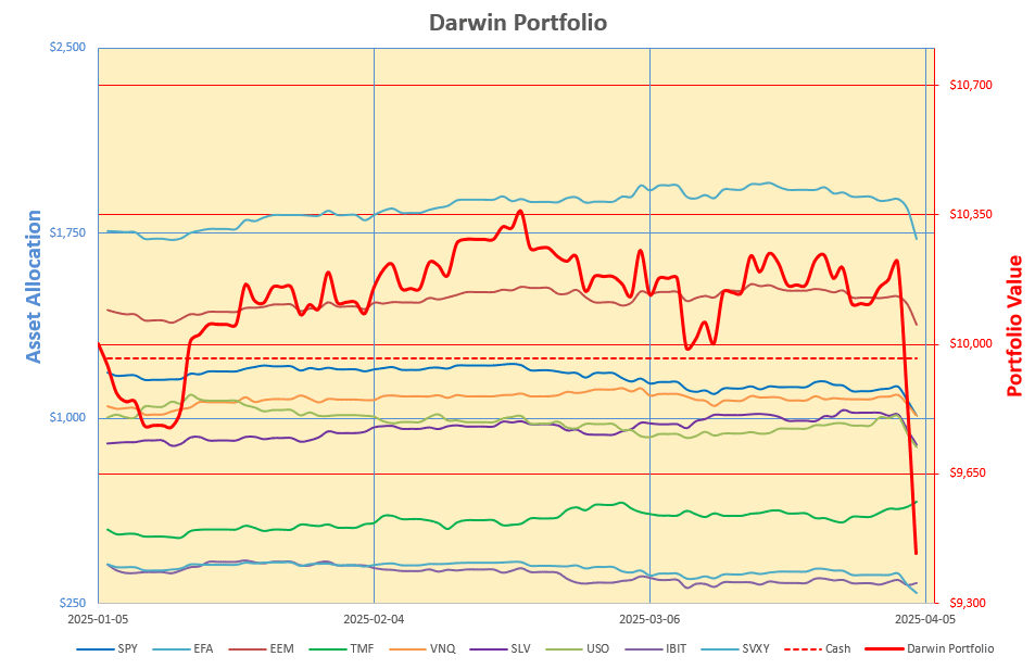
…. not pretty and difficult for an investor to control but better than equities alone.
The Option portion of the Portfolio is again where I had problems and stop loss alerts on bullish positions in EEM, EFA and SLV were triggered, resulting in me closing positions with losses. A Bearish position in USO (Oil) was also closed since it needed adjustment – as price moved too far too fast – and although it was showing a small profit it was easier to close the position and open a new one once the market settles down a bit rather than make an adjustment and add more risk. A bearish (Vertical Spread) position in VOO (US Equities) was closed on Thursday with 85% of the maximum profit taken. Ironicallly, simple Put Options in USO and VOO would have produced significantly better results, but, since this presents more risk, and we can’t predict when “Black (or at least Grey) Swans” like this might come along, I still think that strategies with net premium income are more appropriate to employ in an “investment” portfolio. Leave the more aggressive strategies for speculation or a “Vegas” account.
This still leaves me with positions in VNQ (Real Estate), TLT (Bonds) and IBIT (Crypto) but existing positions in VNQ and TLT were adjusted to lock in profits, reduce risk and, in the case of TLT, to change from a neutral to bullish position. Only IBIT survived the carnage without adjustment as this position is relatively benign.
The current position in VNQ looks like this:
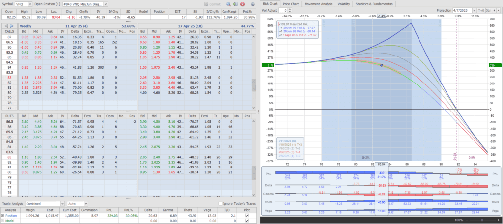 …. a bearish “Diagonal” Put Spread.
TLT Looks like this:
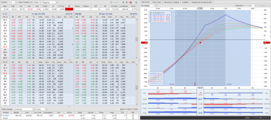 …. two bullish “Diagonal” Call Spreads.
And IBIT:
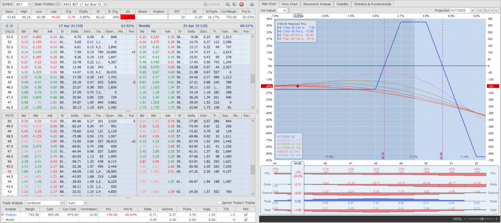
…. an unbalanced “Iron Condor” (Put and Call “Vertical Spreads”) – after earlier adjustments.
In terms of performance – after the dust had settled:
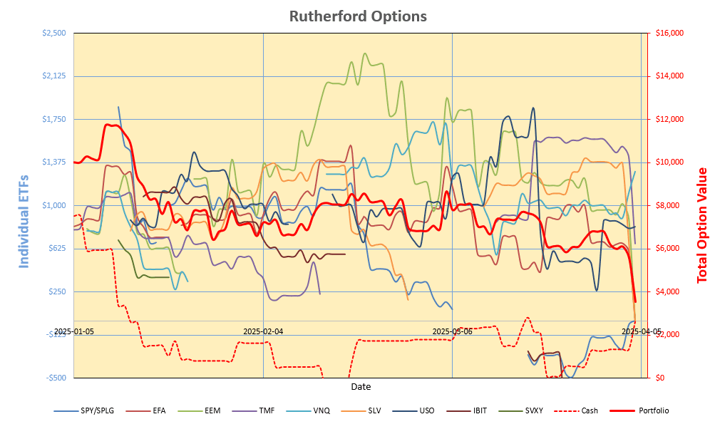
a net loss on trades but with a little extra Cash to play with.
In terms of total portfolio performance (green line), that’s looking like this:
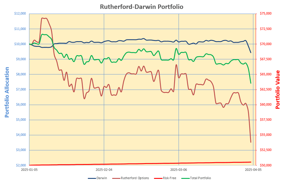 or down ~9% since inception with US Equities (SPX) being down 15% over the same period.
Discover more from ITA Wealth Management
Subscribe to get the latest posts sent to your email.
You must be logged in to post a comment.