
Walkers visit ancient burial site.
Updating the sector BPI data this morning revealed that only Real Estate remains in the over-sold zone. Sectors that were over-sold last weekend have since moved above the 30% bullish line. With little cash remaining in the Gauss coffer I squeezed in a few more shares of VNQ this morning after the market opened.
Gauss Sector BPI Quiver and Holdings
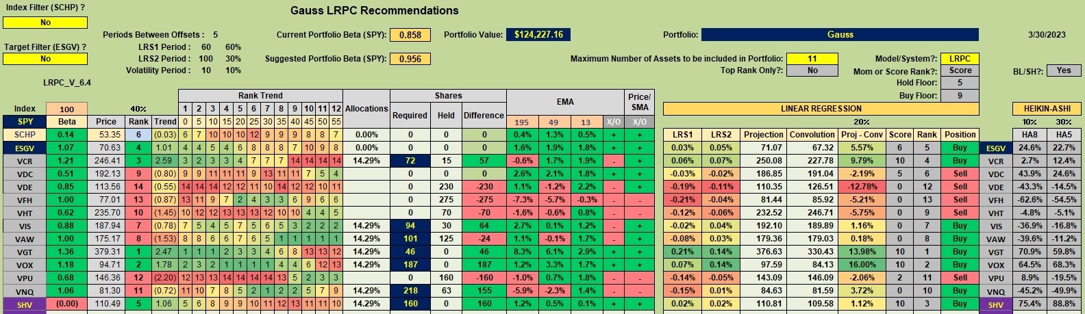
Below is the tranche worksheet extracted from the Kipling spreadsheet. VNQ or Real Estate is below its recommended percentage and I have a few limit orders outstanding. Even so, don’t expect VNQ to reach the 18% level this Buy/Sell rotation. If the owner added more cash before Real Estate moves out of the over-sold zone I would purchase more shares of VNQ.
Point and Figure (PnF) Graph of Real Estate
In one of the comments a reader suggested waiting until trend lines point up before buying or down before selling. That is certainly an option, but one I’ll leave for others to test.
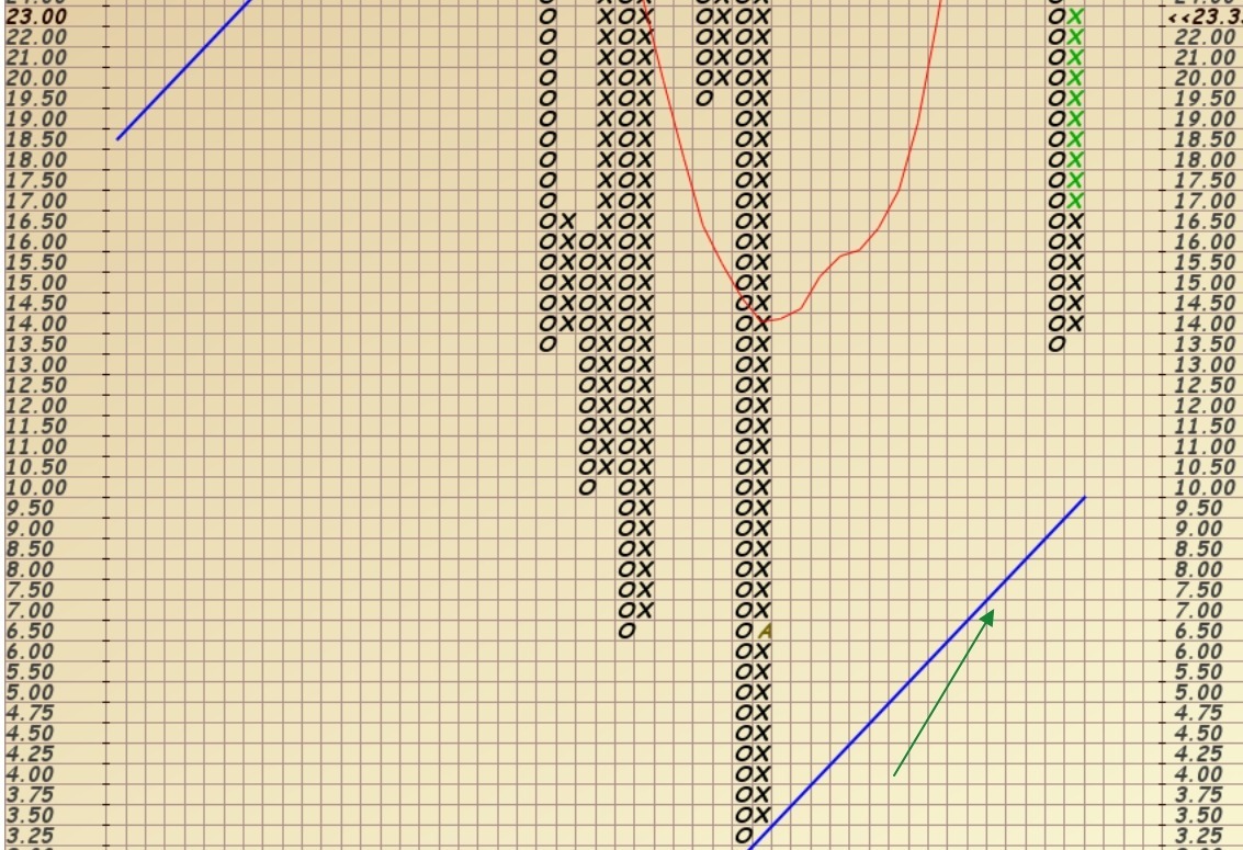
The following table is the current Point and Figure (PnF) BPI graph for Real Estate. Note the percent of bullish stocks within the Real Estate sector move from around 13% up to a current level of 23.3%. This is still within the over-sold zone so I am still buying shares of VNQ if and when cash is available. This morning I purchased more shares of VNQ using first quarter dividends.
The green arrow points to a positive trend for this sector.
Gauss Performance Data
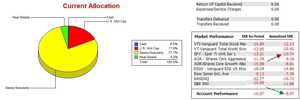
Over the past 15 months the Gauss outperformed all benchmarks with exception of the DJIA and that is not an ETF for purchase. For the Gauss I am using SPY as the benchmark and the Gauss has a lead of two percentage points annualized. Can the portfolio maintain this lead is the big question?
Gauss Risk Ratios
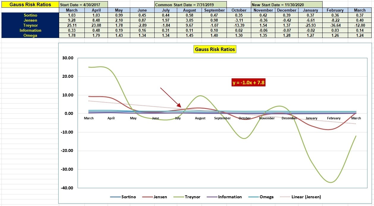
For the first time since last October the Jensen Performance Index is back in the black. We also see significant improvement in the Information Ratio.
The risk data is encouraging for the Sector BPI model. We will know a lot more in a few more months.
Gauss Portfolio Update: 19 March 2023
Discover more from ITA Wealth Management
Subscribe to get the latest posts sent to your email.
Lowell,
What real estate ETF are you using in the above PnF chart? The price axis doesn’t match the current VNQ price that is in the low 80s.
~jim
Jim,
The Real Estate BPI is different from the Real Estate ETF one uses to invest in the sector. VNQ is the ETF I use to invest in the sector while the Real Estate BPI measures what percentage of the stocks within the sector are bullish.
I tried to explain this in one of the more recent BPI posts, but was not completely successful.
Lowell
Lowell,
Ignore my question above. I just figured out that you can create PnF charts for Bullish Percent Indexes.
~jim
Jim,
Not only BPI for indexes, but BPI for sectors. To my knowledge, StockCharts does not provide BPI graphs for asset classes such as mid-cap value, etc. Someone asked that question months ago and I was not able to find such graphs within StockCharts.
Lowell